我有一个如下所示样式的切换按钮,切换按钮工作正常,但我想在打开主窗口时为切换按钮设置一个默认文本,它应该显示为假状态,而不是禁用状态
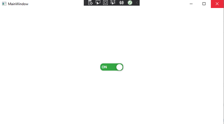
切换按钮将显示文本值,只有当我对它做的行动(设置为开或关),它将显示文本,但默认情况下,它似乎是用户禁用(见图片)。
- 启动应用程序后:**

- 设置为开:**
- 设置为关闭:**
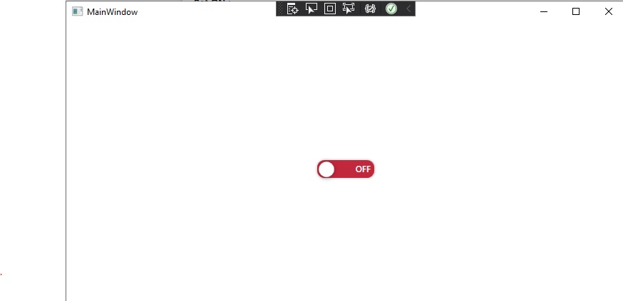
问题是当我在点击切换按钮之前运行应用程序时,屏幕中显示的是一个Tooglebutton被禁用,我需要将此控件初始化为状态"OFF",
有可能吗?
我怎么能那样做呢?
- 应用程序xaml**
<Style x:Key="myToggleSwitch" TargetType="{x:Type ToggleButton}">
        <Setter Property="Template">
            <Setter.Value>
                <ControlTemplate TargetType="{x:Type ToggleButton}">
                    <Grid x:Name="toggleSwitch">
                        <Border x:Name="Border" CornerRadius="10"
        Background="#FFFFFFFF"
        Width="80" Height="25">
                            <Border.Effect>
                                <DropShadowEffect ShadowDepth="0.5" Direction="0" Opacity="0.3" />
                            </Border.Effect>
                            <Ellipse x:Name="Ellipse" Fill="#FFFFFFFF" Stretch="Uniform"
             Margin="2 2 2 1"
             Stroke="Gray" StrokeThickness="0.2"
             HorizontalAlignment="Left" Width="22" >
                                <Ellipse.Effect>
                                    <DropShadowEffect BlurRadius="10" ShadowDepth="1" Opacity="0.3" Direction="260" />
                                </Ellipse.Effect>
                            </Ellipse>
                        </Border>

                        <TextBlock x:Name="txtOff" Text="OFF" Margin="0 0 40 0" VerticalAlignment="Center" FontWeight="DemiBold" HorizontalAlignment="Right" Foreground="White" FontSize="12" />
                        <TextBlock x:Name="txtOn" Text="ON" Margin="40 0 0 0" VerticalAlignment="Center" FontWeight="DemiBold"  Foreground="White" HorizontalAlignment="Left" FontSize="12" />
                    </Grid>

                    <ControlTemplate.Triggers>
                        <Trigger Property="ToggleButton.IsChecked" Value="True" >
                            <Trigger.EnterActions>

                                <BeginStoryboard>

                                    <Storyboard>
                                        <ColorAnimation Storyboard.TargetName="Border"
                                Storyboard.TargetProperty="(Border.Background).(SolidColorBrush.Color)"
                                To="#34A543"
                                Duration="0:0:0.1" />

                                        <ThicknessAnimation Storyboard.TargetName="Ellipse"
                                    Storyboard.TargetProperty="Margin"
                                    To="56 2 2 1"
                                    Duration="0:0:0.1" />
                                        <DoubleAnimation
                            Storyboard.TargetName="txtOff"
                            Storyboard.TargetProperty="(TextBlock.Opacity)"
                            From="1.0" To="0.0" Duration="0:0:0:0.1"     />
                                        <DoubleAnimation
                            Storyboard.TargetName="txtOn"
                            Storyboard.TargetProperty="(TextBlock.Opacity)"
                            From="0.0" To="1.0" Duration="0:0:0:0.1"  />
                                    </Storyboard>
                                </BeginStoryboard>
                            </Trigger.EnterActions>
                            <!--  some out fading  -->
                            <Trigger.ExitActions>
                                <BeginStoryboard>
                                    <Storyboard>
                                        <ColorAnimation Storyboard.TargetName="Border"
                                Storyboard.TargetProperty="(Border.Background).(SolidColorBrush.Color)"
                                To="#C2283B"
                                Duration="0:0:0.1" />
                                        <ThicknessAnimation Storyboard.TargetName="Ellipse"
                                    Storyboard.TargetProperty="Margin"
                                    To="2 2 2 1"
                                    Duration="0:0:0.1" />
                                        <DoubleAnimation
                            Storyboard.TargetName="txtOff"
                            Storyboard.TargetProperty="(TextBlock.Opacity)"
                            From="0" To="1.0" Duration="0:0:0:0.1"       />
                                        <DoubleAnimation
                            Storyboard.TargetName="txtOn"
                            Storyboard.TargetProperty="(TextBlock.Opacity)"
                            From="1.0" To="0.0" Duration="0:0:0:0.1" />
                                    </Storyboard>
                                </BeginStoryboard>
                            </Trigger.ExitActions>
                            <Setter Property="Foreground" Value="{DynamicResource IdealForegroundColorBrush}" />
                        </Trigger>
                        <Trigger Property="IsMouseOver" Value="False">
                        </Trigger>

                        <Trigger Property="IsEnabled" Value="False">
                            <Setter Property="Foreground" Value="{DynamicResource GrayBrush7}" />
                        </Trigger>
                    </ControlTemplate.Triggers>
                </ControlTemplate>
            </Setter.Value>
        </Setter>
        <Setter Property="VerticalContentAlignment" Value="Center" />
</Style>- 主窗口. xaml. cs**
<Grid>
    <ToggleButton  x:Name="tog" Style="{StaticResource myToggleSwitch}" Width="150" Checked="tog_Checked" Unchecked="tog_Unchecked" ></ToggleButton>
</Grid>- 更新日期:**
<Style x:Key="myToggleSwitch" TargetType="{x:Type ToggleButton}">
        <Setter Property="IsChecked" Value="False"/> <!-- What I have added -->
        <Setter Property="Template">

            <Setter.Value>
                <ControlTemplate TargetType="{x:Type ToggleButton}">
                    <Grid x:Name="toggleSwitch">
                        <Border x:Name="Border" CornerRadius="10"
        Background="#FFFFFFFF"
        Width="80" Height="25">
                            <Border.Effect>
                                <DropShadowEffect ShadowDepth="0.5" Direction="0" Opacity="0.3" />
                            </Border.Effect>
                            <Ellipse x:Name="Ellipse" Fill="#FFFFFFFF" Stretch="Uniform"
             Margin="2 2 2 1"
             Stroke="Gray" StrokeThickness="0.2"
             HorizontalAlignment="Left" Width="22" >
                                <Ellipse.Effect>
                                    <DropShadowEffect BlurRadius="10" ShadowDepth="1" Opacity="0.3" Direction="260" />
                                </Ellipse.Effect>
                            </Ellipse>
                        </Border>

                        <TextBlock x:Name="txtOff" Text="OFF" Margin="0 0 40 0" VerticalAlignment="Center" FontWeight="DemiBold" HorizontalAlignment="Right" Foreground="White" FontSize="12" />
                        <TextBlock x:Name="txtOn" Text="ON" Margin="40 0 0 0" VerticalAlignment="Center" FontWeight="DemiBold"  Foreground="White" HorizontalAlignment="Left" FontSize="12" />
</Grid>- 更新2**(测试Jason的解决方案)。
这是我得到的:

1条答案
按热度按时间3hvapo4f1#
因为你的颜色是通过对
IsChecked状态变化的React来设置的,所以你只需要你的初始值来匹配false状态。把边框颜色设置为关闭的颜色(红色)而不是白色。这应该会得到你想要的。同时将“打开”文本的默认不透明度设定为0,以防止其显示。